SAGA SSP PROJECT
佐賀県SSPプロジェクト推進グループ
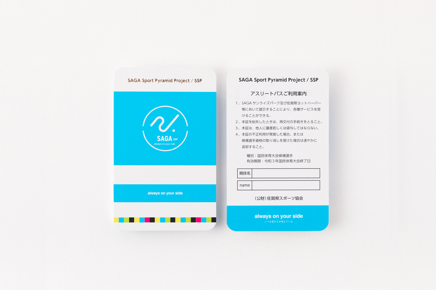
SSPで発行するオリンピック候補、国体候補選手などのスポーツ選手に配られるパスカードのデザイン。テーマカラーであるブルーを中心に色合いを丁寧に表現しています。蛍光インクを使用し割合を調整して発色の良い色合いにしています。
佐賀県文化・スポーツ交流局/さがスポーツピラミッド構想(SSP)
SSP project logo mark design. This is a project in which Saga Prefecture raises and supports athletes. We designed the common shape seen in the initial movement when a person tries to exercise.
In addition, I was in charge of designing pass cards to be distributed to athletes such as Olympic candidates and national polity candidates issued by SSP. The color tone is carefully expressed centering on the theme color blue. Fluorescent ink is used and the ratio is adjusted to create a good color.
Saga Prefectural Culture and Sports Exchange Bureau / Saga Sports Pyramid Concept (SSP)

Client
Sunrise 328
Direction
Jun Tanaka
Design
Jun Tanaka
Yuki Ito