SHIROISHIMORI
しろいしもり / omusubi
おむすびのパッケージデザインです。
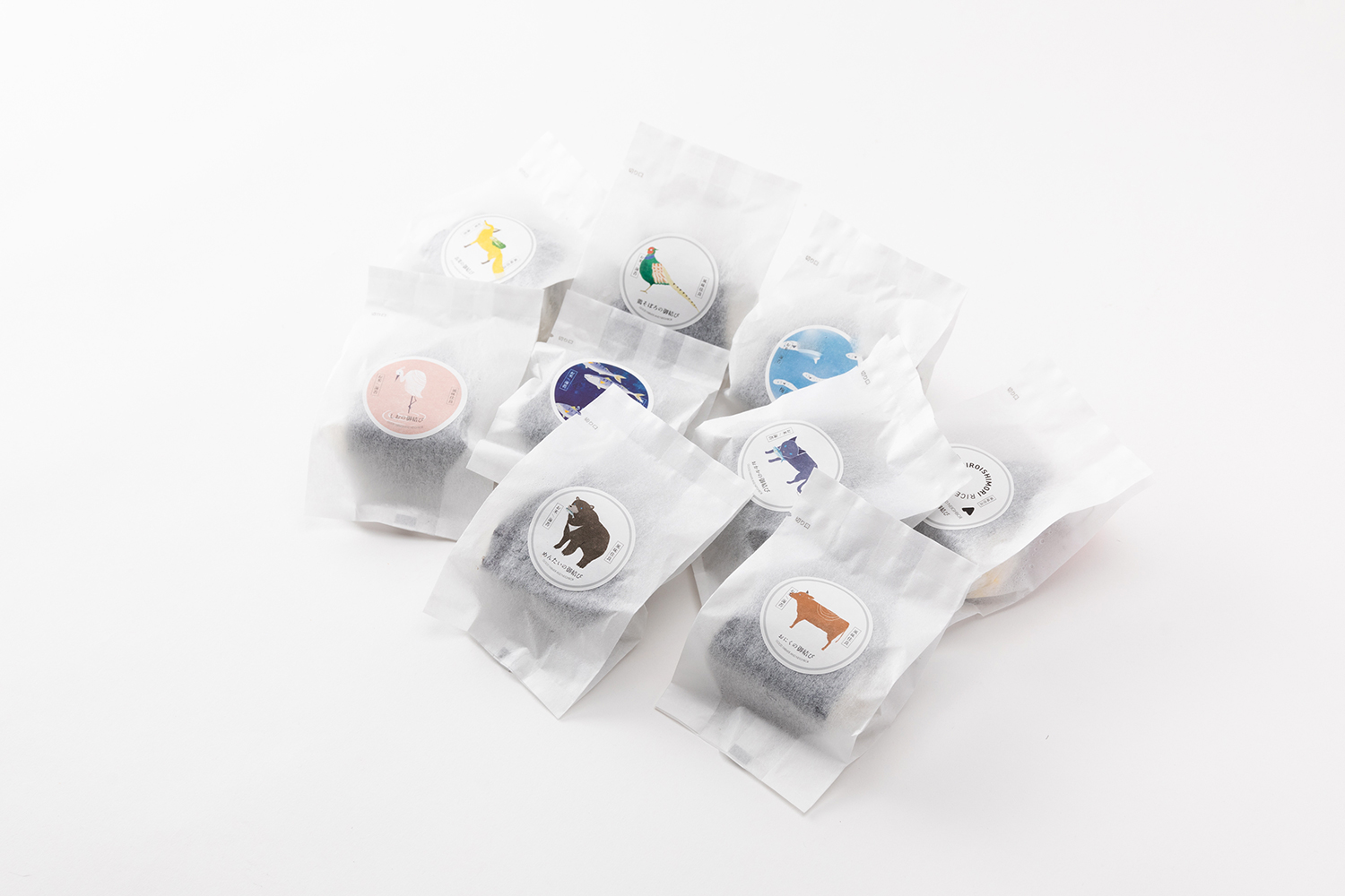
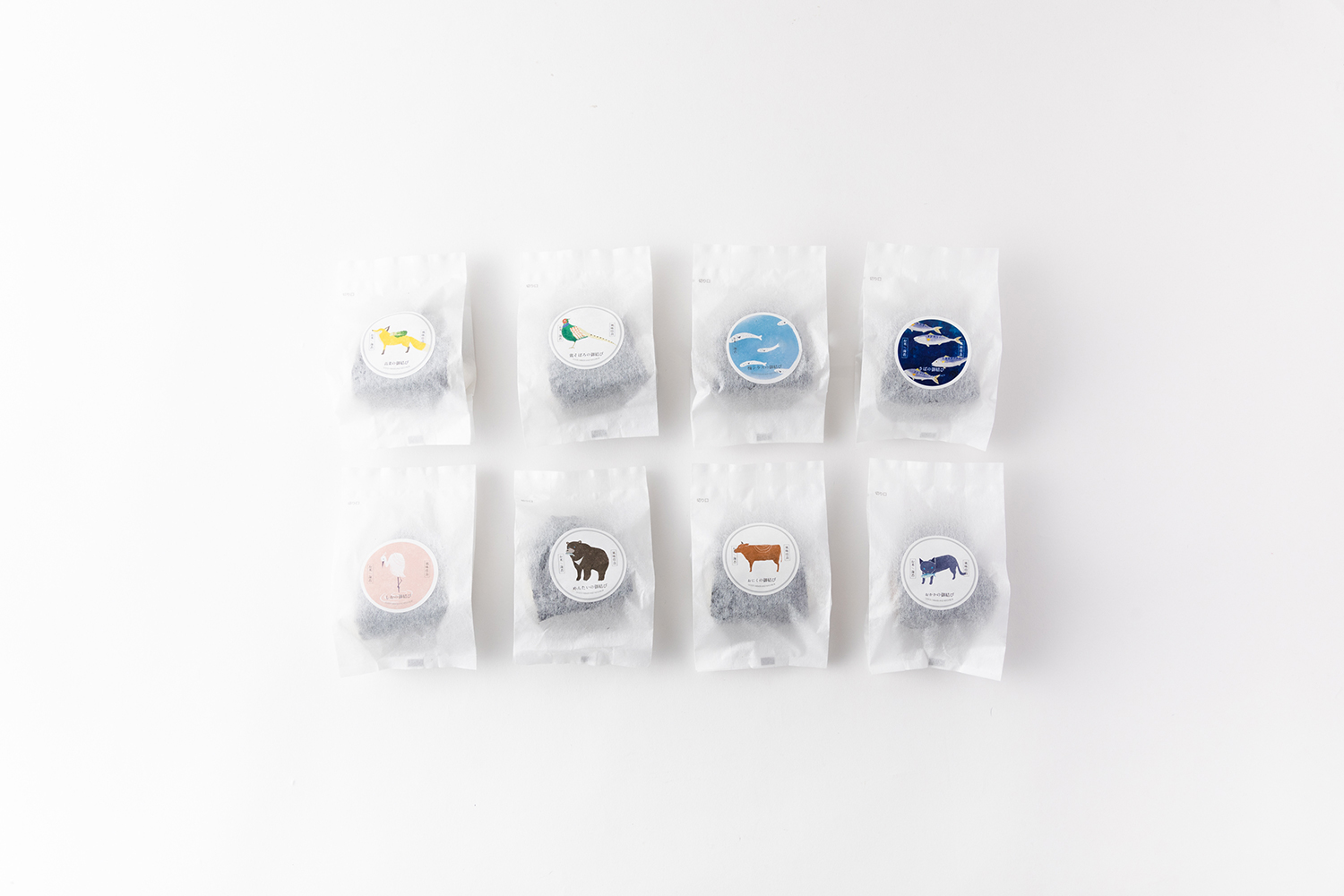
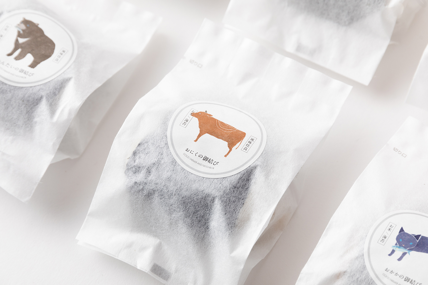
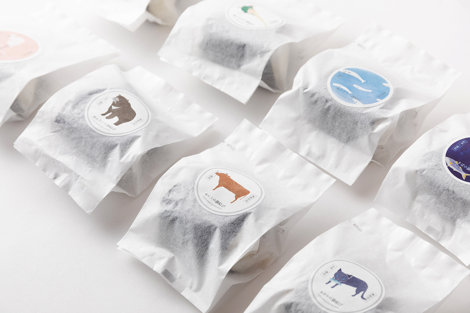
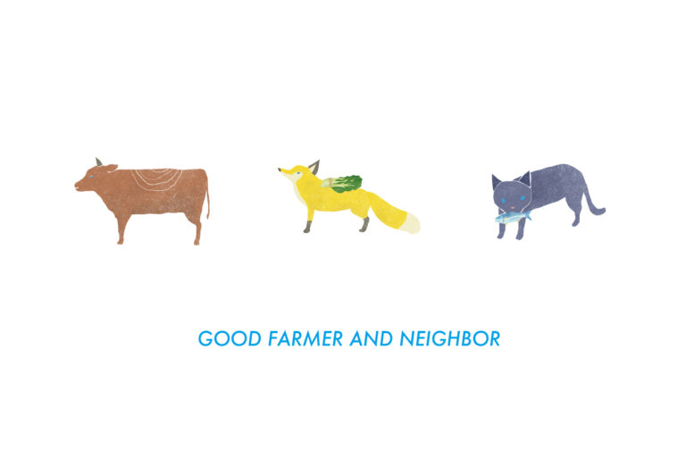
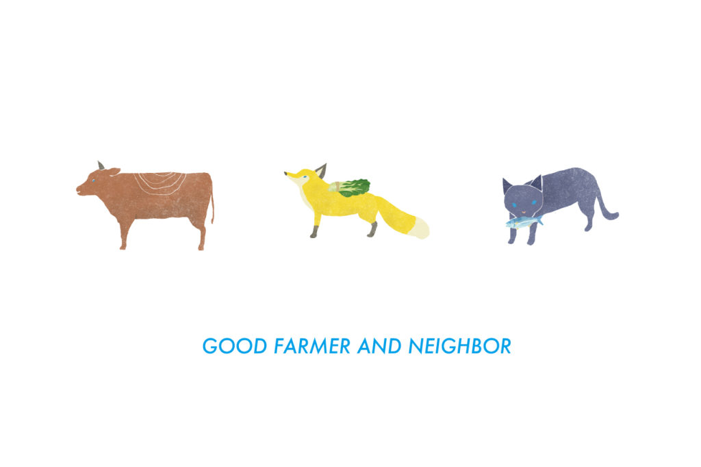
Good farmer and neighborー”食べることと生産することが隣り合う仲間のように繋がっている”をコンセプトに展開する、生産者さん自身によるお米・海苔・おむすびのブランド「しろいしもり」。
まずはじめに、対対/tuiiでは、ブランドの世界観を表す物語と絵本型のパンフレットを制作しました。くま、しらさぎ、きつね。お話の中で仲間として集まってくる動物たちを「しろいしのりの御結び」の1つ1つのパッケージにしました。並んでいるとどれにしようかな?と選ぶ楽しさがあり、親子の会話もふくらむデザインです。
佐賀県白石町
Tuii is a design unit based in a renovated office of a small building in Matsubara, Saga City. In addition to art direction for companies, brands, products, and products, we also support the opening and operation of stores, and design to create the future of our customers together.
Alignment ≠ fluctuation,Guide ≠ snuggle up
Front and back. Light and shadow.
Contrast, but in essence connected.
We pursue that fusion, harmony, and coexistence.
Client
Sunrise 328
Direction
Jun Tanaka
Design
Jun Tanaka
Yuki Ito